Georgia Tech at VIS 2014
Visualizing the World, One Data Set at a Time
The research field of visualization has burgeoned over the last 25 years in different sectors, taking a concept as old as cave drawings and revolutionizing it with computing tools that vastly increase our understanding of the world. Scientific visualizations (such as those of star systems) or information visualizations (like animated weather forecasts and traffic patterns on TV) are now accompanied by increasingly sophisticated visual counterparts in business, politics, entertainment and virtually countless data sets.
At VIS 2014 - consisting of three IEEE joint conferences on Visual Analytics Science and Technology, Information Visualization, and Scientific Visualization - Georgia Tech researchers played a leading role in the proceedings, which marked the 25th anniversary of academic research in the field.
John Stasko and Alex Endert, Interactive Computing, were on three and four committees, respectively; Stasko co-chaired the 25th anniversary committee (he was the VIS 2013 General Chair) and Endert was a Digital Compass Co-Chair. Rahul C. Basole, Interactive Computing, was an organizer for the “business | vis | 14” workshop. Basole, along with Ph.D. student Hyunwoo Park, recently contributed to the design and implementation of visualizations in a widely covered report on global connectedness from the Center for Global Enterprise.
“As the prevalence and importance of data throughout society continues to rise, people and organizations seek better ways to analyze their data and communicate it to others,” says Stasko, a 2014 IEEE Fellow. “This is especially true in the business community today where so many decisions are data-driven.”
Georgia Tech research at the conferences was highlighted by novel tools and techniques that demonstrated the ability to visualize patterns in massive amounts of data. The contributions this year provided both new visualization techniques and case studies of visualization applied to real world problems from areas such as finance, network cybersecurity, pediatric asthma care, and marine biology.
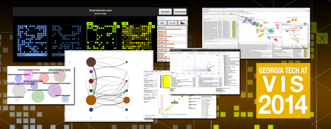
One of these new visualization tools is OnSet, which allows users to effectively explore large-scale data in binary sets. It encourages direct manipulation of the data so that users can explore patterns as the visualization changes. Just as important as the data that is available, OnSet shows what data is missing, which is critical in finding patterns in certain cases. Users may find reason to rejoice with OnSet's ability to visualize multiple calendars, overlaid on one another, and show optimal team meeting times for months or years in advance. In another case, researchers visualized U.S. Senate voting patterns with OnSet, allowing for a comparison of individual senator votes on more than 100 bills. Users can interact with the Senate data or upload any binary data sets and make their own visualizations now.
Other examples of Georgia Tech visualization innovation:
VisIRR, a robust recommendation engine, seeks to empower users with new levels of data customization in the age of online search.
GLO-STIX takes a holistic approach to enabling functionality for visualizing network- or graph-based data, such as that found in online social communities.
Safe Passage, using location- and time-based data, simply attempts to keep users safe from high crime urban areas.
Full listing of Georgia Tech research at VIS 2014
One trend that Stasko has seen develop over the years is the importance of visualization for data from everyday life.
“I see a growing ‘democratization' of data visualization where more people and organizations can now create sophisticated interactive visualizations due to some of the tools and toolkits that the visualization research community has created,” he says.
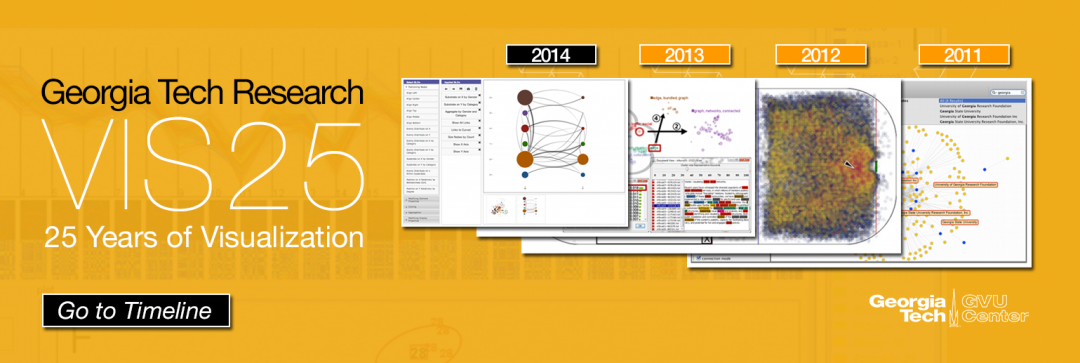
Georgia Tech, in fact, has been one of the top research universities contributing to IEEE VIS for almost the entire 25 years of the conference. A visualization of 25 years of VIS papers, developed by Stasko and his students, shows this commitment and provides in-depth access to leading research. For the VIS25 anniversary in Paris, the record crowd of 1,200 experienced a curated gallery of visualization research milestones. An interactive version is online at the VIS25 Timeline and you can view a compilation of select Georgia Tech visualization research over the years here.
Writer: Joshua Preston
Photos: James D. Foley

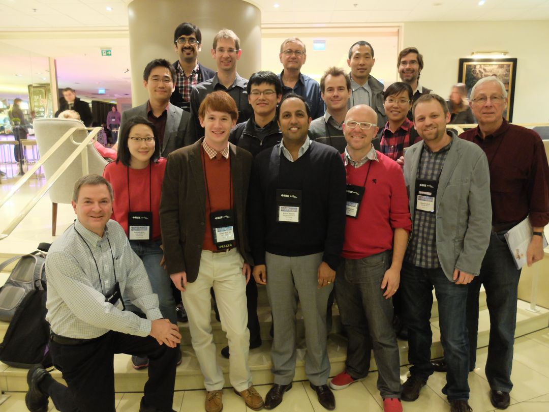
Front row: IC Prof. John Stasko; Hannah Kim, CS MS student; Chad Stolper, IC PhD student; IC Prof. Rahul Basole; Prof Niklas Elmqvist, U Maryland, visiting PhD student 2006 with John Stasko; IC Prof. Alex Endert; IC Prof. Jim Foley.
Second row: Jaegul Choo, Georgia Tech, CSE PhD 2013, advisor Haesun Park; Yi Han, IC PhD student; Alex Godwin, IC PhD student; Tanyoung Kim, Nokia, LMC PhD 2013, advisor Carl DiSalvo.
Third row: Ramik Sadana, IC PhD student; Carsten Görg, University of Colorado Medical School, PostDoc with John Stasko 2008-2010; Barry Drake, GTRI Senior Research Scientist; Prof. Ji Soo Yi, Purdue, PhD 2008, advisor John Stasko; Prof James Eagan, Telecom-ParisTech, PhD 2008, advisor John Stasko.

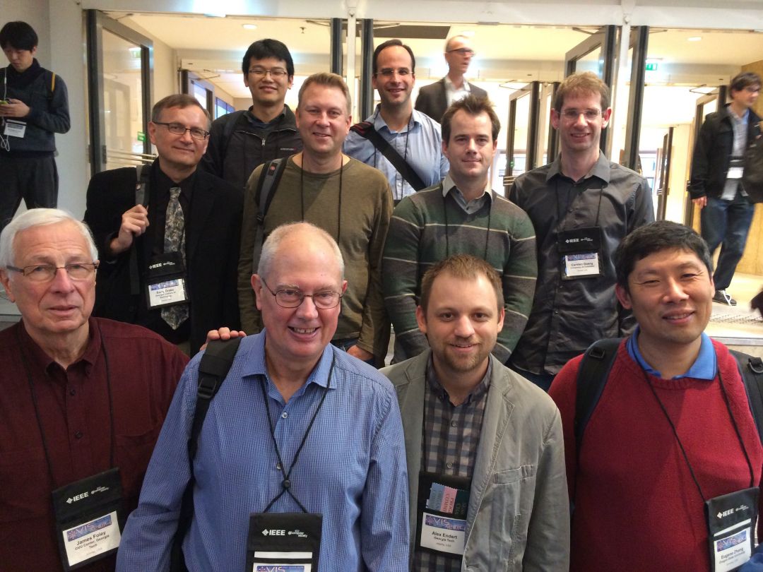
Front Row: IC Prof. Jim Foley; Prof. Bill Ribarsky, UNC-Charlotte, former IC Principal Research Scientist; Prof. Eugene Zhang, Oregon State, PhD 2004, advisor Greg Turk;
Second Row: Barry Drake, GTRI SRS; Peter Lindstrom, Lawrence Livermore, PhD 2000, advisor Greg Turk; Alex Godwin, IC PhD student; Carsten Görg, University of Colorado Medical School, PostDoc with John Stasko)
Third Row: Yi Han, IC PhD student; Prof. David Gotz, UNC, BSCS 1999.
Related Links:
VIS 2014, Georgia Tech Research
VIS 25th Anniversary, Georgia Tech Timeline


