
|
We developed a visual analytics system, VitaLITy, to promote serendipitous discovery of academic papers wherein users may “stumble upon” relevant literature, when other search approaches may fail. VitaLITy (1) utilizes transformer language models to help users find semantically similar papers given a list of seed paper(s) or a working abstract, (2) visualizes the embedding space in an interactive 2-D scatterplot, and (3) summarizes meta information about the paper corpus (e.g., keywords, co-authors, citation counts, and publication year).  Website: |
Face-to-face video communication technologies have grown tremendously in recent years, however they are not designed to provide a persistent sense of remote presence. More recently, telepresence robots give single users the ability to have a remote and mobile physical presence in another space. Combining telepresence robotics with persistent large-scale displays and multiple viewports, VPorter creates a telepresence ecology to support team collaboration across remote but connected lab spaces. 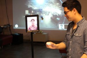 |
VROOM Lab: This project investigates the effect of providing this information on users’ virtual experience, wellbeing, and behavior in the dynamic real-world environment. 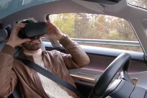 |
WAG'D is a platform for real-time monitoring and characterization of canine health and performance during training and high-intensity athletic activities such as sled pulling and canine cross-country. We focus on working to improve training outcomes, and reduce the incidence of injury during training and competition events. 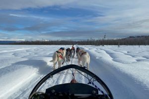 |
|
People increasingly rely on visual representations of information to explore and make sense of data. However, people have inherent biases that often lead to errors and inefficiencies in the decision making process. The goal of our research is to help people make better decisions while exploring and analyzing data using visualizations. We introduce computational methods for quantifying an analyst’s biases based on their interactions in the visualization. Using that information, we illustrate ways to modify or design new visualization systems that mitigate biased decision making.  |
This project aims to make a wayfinding system for people with visual impairments. The case of this project is the basement of the JS Coon Psychology at Georgia Tech. This system consists of 2 phases; in the first phase, a 2D audio-based navigational system is prepared and applied to the case site. The second phase provides a 3D Photorealistic Virtual model of the basement. This virtual model will be used for training purposes in other visual-impairment wayfinding projects running by different research teams at Georgia Tech. |
Data visualization can be an important guiding force in scientific debates and casual discussions alike. Bringing data visibly into the world can inform and bring attention to critical issues, as well as help us develop a more personal relationship with the data. This project aims to promote awareness and stimulate discussion about climate change through visualizing personal carbon footprint data on clothing. It explores the placement of visualizations in the social sphere, as well as revealing unseen individual and systematic responsibility for carbon emissions. |
The Wearable Technology Designer's Web Tool is a tool that leads designers / developers through a series of questions about their wearable technology project. The questions are designed to force designers to think of all options at the beginning of a project, illuminating opportunities and shortcomings in accessibility caused by decisions along the way. |
|
Visualizing sets to reveal relationships between constituent elements is a complex representational problem. Recent research presents several automated placement and grouping techniques to highlight connections between set elements. However, these techniques do not scale well for sets with cardinality greater than one hundred elements. We present OnSet, an interactive, scalable visualization technique for representing large-scale binary set data. |
The AEL has been preparing and pioneering this idea for ten years with our custom browser, Argon. Drawing on this background, we are now transitioning to the use of open-source technology such as A-frame and the Mozilla browser, WebXR viewer.  |
This project explores the concept of hyperspatial navigation by using the WebXR prototype RealityMedia 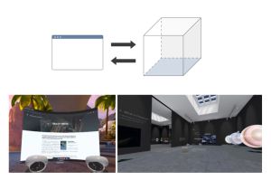 Website: |
A few Fridays ago, the Public Design Workshop (PDW) led a Design and Policy Jam with the Westside Atlanta Land Trust (WALT) Program. WALT's mission is “to organize the community's power for self-determination; to serve and preserve in-place residents, small business owners, and their successive generations in redeveloping areas.” The jam session supported this mission by tasking participants with researching and producing an argument for a city-wide community land trust (CLT) policy.  |
|
Westside Soul is an interactive installation that was displayed at the Historic Westside Cultural Arts Council's Black History Month Celebration. The installation displays videos of westside residents discussing issues in their community and allows viewers to add new responses through text and video. The installation is part of on ongoing partnership with the westside to explore the use of mobile and social computing and digital media to connect community members and instigate alternate forms of civic engagement.  |
The news is the source citizens turn to in order to gain accurate information about the current events of the world. Unfortunately, a large number of trusted news sources are the worst perpetrators of bias; effectively skewing the public's perception of important material. "Who Told it How" is a web-based interactive visualization that displays various elements of the Wendy Davis abortion filibuster, as written in articles by four major news syndicates, in order to expose bias and provide perspective. 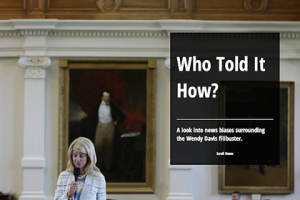 |
